Final Report
Motivation
During the first couple of months in New York, one of our group members witnessed a car accident which caused a huge traffic jam on her way to class. This experience motivates us to do some research and investigate car accidents in New York. According to the Department of Health in New York, there were 1,098 deaths each year due to unintentional motor vehicle traffic-related injuries and 12,093 hospitalizations each year due to motor vehicle traffic-related injuries.
Therefore, we are interested in exploring some factors related to car accidents. Through data analysis, we will obtain the peak time period, concentrated areas, and main causes of accidents, aiming to effectively decrease the rate of car accidents taking place and further ensure personal safety.
Aim
- Explore how month, weekday, and hour influence the number of accidents
- Investigate which borough has the most accidents and which has the least
- Build linear regression of accidents with weekday, hour, borough, and weather
- Figure out if any relationship between the number of accidents and car types
- Address the association of number of injuries and killed with borough
- Visualize the number of accidents and number of injuries
Data Processing and Cleaning
We used two datasets from Kaggle to conduct our analysis of the car accidents in New York City:
NYC Rush Hour Accidents
Motor vehicle collisions reported by the New York City Police Department from January-August 2020. Each record represents an individual collision, including the date, time and location of the accident (borough, zip code, street name, latitude/longitude), vehicles and victims involved, and contributing factors.
For the process of data cleaning, we focused on five boroughs in NY for our analysis, and we changed the borough name from all caps to only the first letter in capital. Then we separated the crash date variable into year, month, and day, and separated the crash time variable into hour, minute, and second. Also, we releveled the month and weekday into their standard name. Furthermore, we filtered out all the missing values in the borough.
These are the important variables in our analysis:
crash_data: date the car accident happened (split into year, month, day)crash_time: time the car accident happened during a day (split into hour, minute, second)borough: borough in which the car accident happenedcontributing_factor_vehicle: the contributing factor of the car accidentvehicle_type_code: type of cars in the car accidentweekdays: weekdays from Monday to Sundayweekdays_type: type of weekdays (workdays and weekends)Lat: latitude of the accidentsLong: longitude of the accidents
US Accidents (2016-2021)
This is a countrywide car accident dataset, which covers 49 states of the USA. The accident data are collected from February 2016 to Dec 2021, using multiple APIs that provide streaming traffic incident (or event) data. These APIs broadcast traffic data captured by a variety of entities, such as the US and state departments of transportation, law enforcement agencies, traffic cameras, and traffic sensors within the road-networks. Currently, there are about 2.8 million accident records in this dataset.
To be consistent with the other dataset, we only focus on the data points that are in 2020 and New York. In the filtered dataset, these are the variables that we are interested in for analysis:
severity: severity of the accident, a number between 1 and 4. Where 1 indicates the least impact on traffic and 4 represents the most serious impactwind_speed _mph: the wind speed when the accidents happened, measured in miles per hour
EDA
Car Accidents Frequency
First, we will focus on factors that relate to the number of accidents. We use bar charts to illustrate the number of accidents by contributing factors, street, borough and month, and day.
10 Most Common Contributing Factors
contr_factors =
  accidents1 %>%
  count(contributing_factor_vehicle_1) %>%
  mutate(
    contributing_factor_vehicle_1 = fct_reorder(contributing_factor_vehicle_1, n),
    ranking = min_rank(desc(n))
  ) %>%
  filter(ranking <= 10) %>%
  arrange(n)

contr_factors %>%
  ggplot(aes(x = contributing_factor_vehicle_1, y = n, fill = contributing_factor_vehicle_1)) +
  geom_col() +
  labs(title = "10 Most Common Contributing Factors of Car Accidents",
       x = "Contributing Factors",
       y = "Number of Car Accidents") +
  coord_flip() +
theme(legend.position = "none", plot.title = element_text(hjust = 1)) 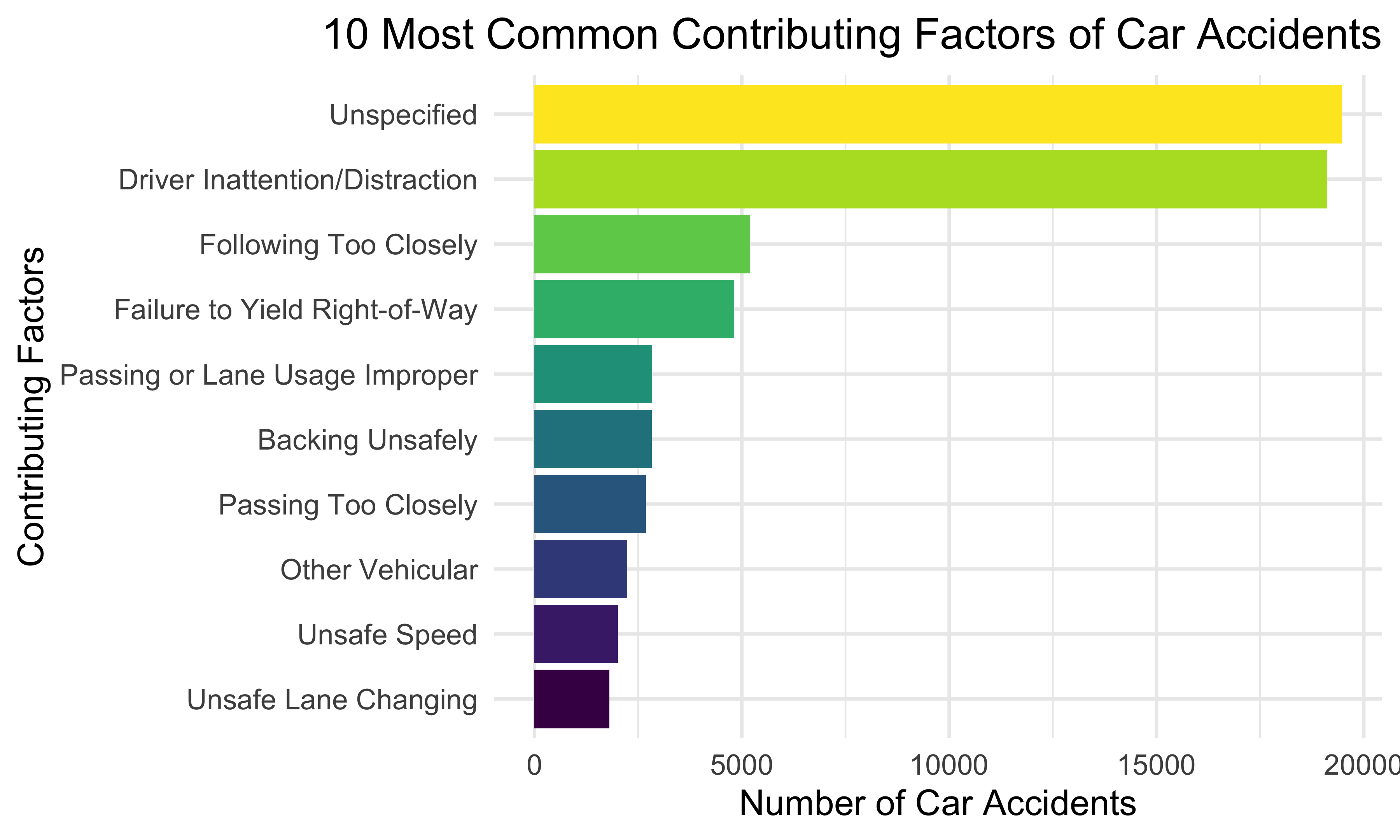
We first tried to figure out which factors are the leading factors of car accidents. We constructed a bar plot illustrating the top 10 most common contributing factors of car accidents. Except accidents without specified reasons, drivers’ inattention and distraction are shown to be the top common factor resulting in car accidents. Other common reasons include following the front car too closely, failure to yield right-of-way, and so forth.
Top 10 Streets of Accidents
streets =
  accidents1 %>%
  filter(on_street_name != "NA") %>%
  count(on_street_name) %>%
  mutate(
    on_street_name = fct_reorder(on_street_name, n),
    ranking = min_rank(desc(n))
  ) %>%
  filter(ranking <= 10) %>%
  arrange(n)

streets %>%
  ggplot(aes(x = on_street_name, y = n, fill = on_street_name)) +
  geom_col() +
  labs(title = "Top 10 Streets of Car Accidents",
       x = "Street Name",
       y = "Number of Car Accidents") +
  coord_flip() +
theme(legend.position = "none", plot.title = element_text(hjust = 0.5)) 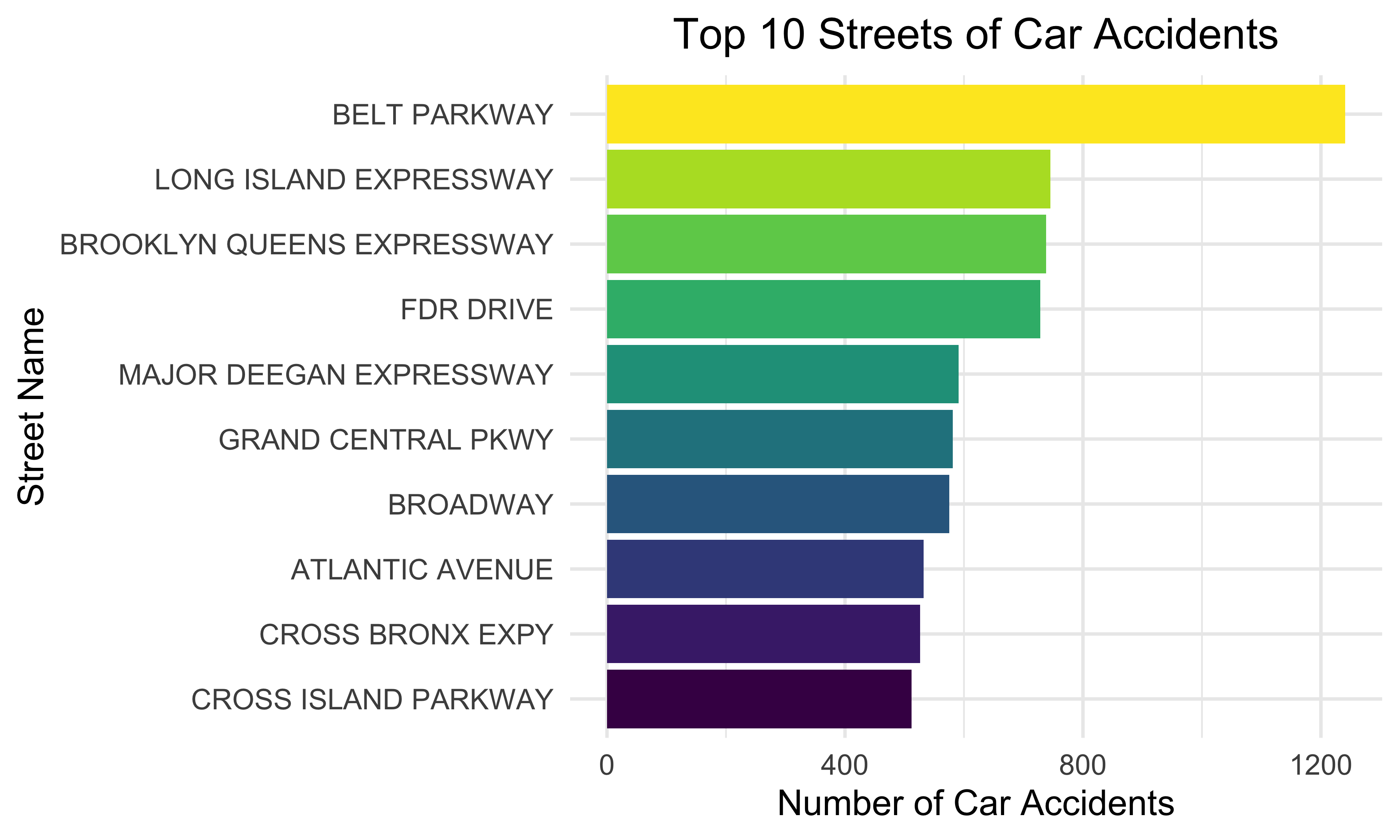
Then, we explored the streets where most car accidents have taken place. The bar graph indicates that Belt Parkway has the most car accidents. Long Island Expressway, Brooklyn Queens Expressway, and FDR Drive also have a relatively great amount of accidents.
Number of Accidents in Boroughs by Month
accidents1 %>%
  filter(borough != "NA") %>%
  group_by(borough) %>%
  count(month) %>%
  mutate(month = month.abb[month],
         month = fct_relevel(month, c("Jan", "Feb", "Mar", "Apr","May","Jun", "Jul", "Aug"))) %>%
  ggplot(aes(x = month, y = n, fill = borough)) +
  geom_bar(stat = "identity",
           position = "dodge") +
  labs(
    title = "Number of Car Accidents in Boroughs Over Month",
    x = "Month",
    y = "Number of Car Accidents",
    fill = "Borough") +
theme(plot.title = element_text(hjust = 0.5)) 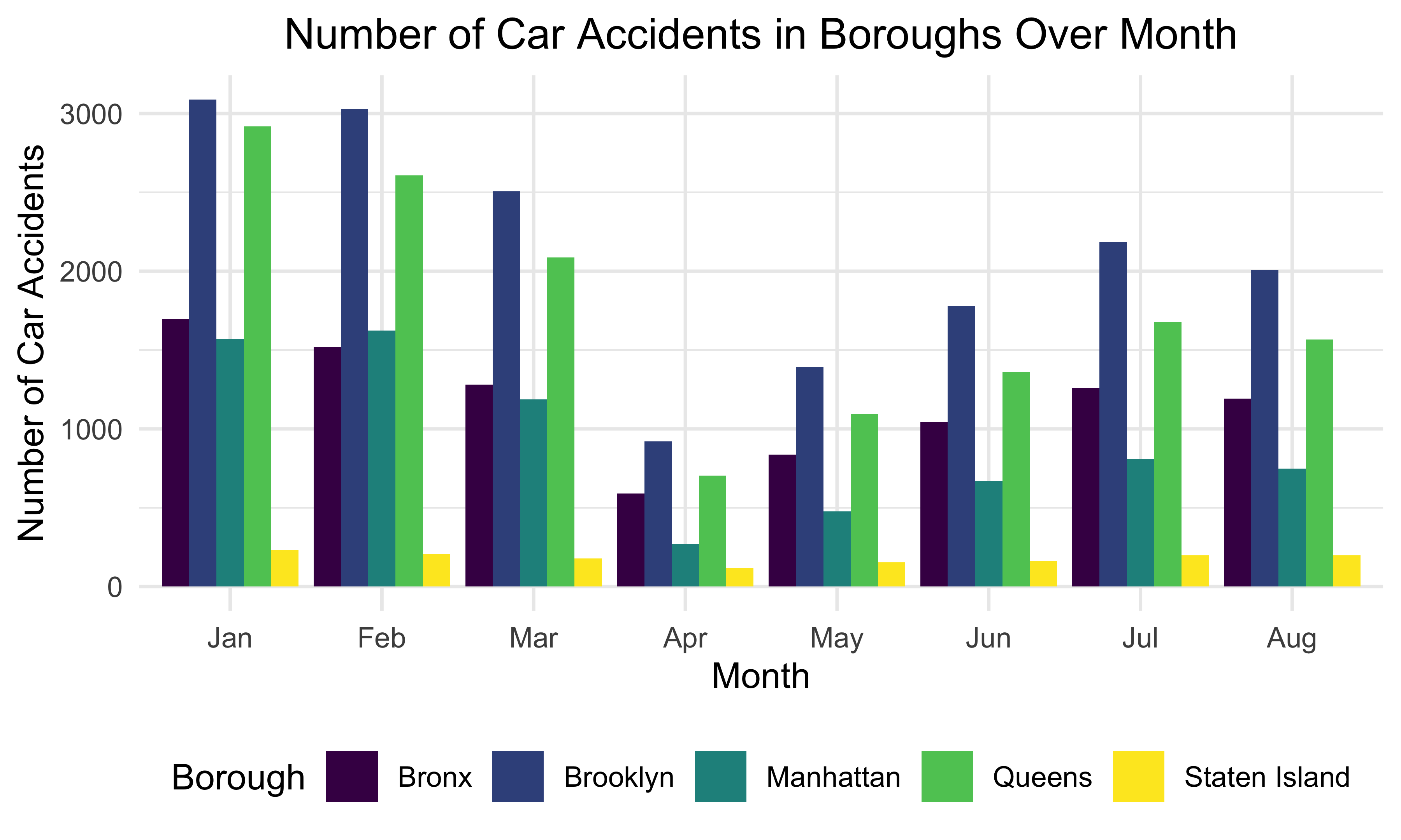
We also investigated the overall pattern of car accidents in different boroughs over months. There tend to be most car accidents in January and February while least car accidents took place in April. Overall, the number of car accidents decreases from January to April and increases from April to July. Brooklyn seems to have the most car accidents while least car accidents occurred in Staten Island over the 8 months in New York City.
Overall Number of Accidents by Day
accidents1 %>%
  group_by(crash_date) %>%
  count(crash_date) %>%
  ggplot(aes(x = crash_date, y = n, color = n)) +
  geom_col() +
  labs(title = "Overall Number of Accidents by Day",
       x = "Day",
       y = "Number of Car Accidents") +
theme(legend.position = "right", plot.title = element_text(hjust = 0.5)) 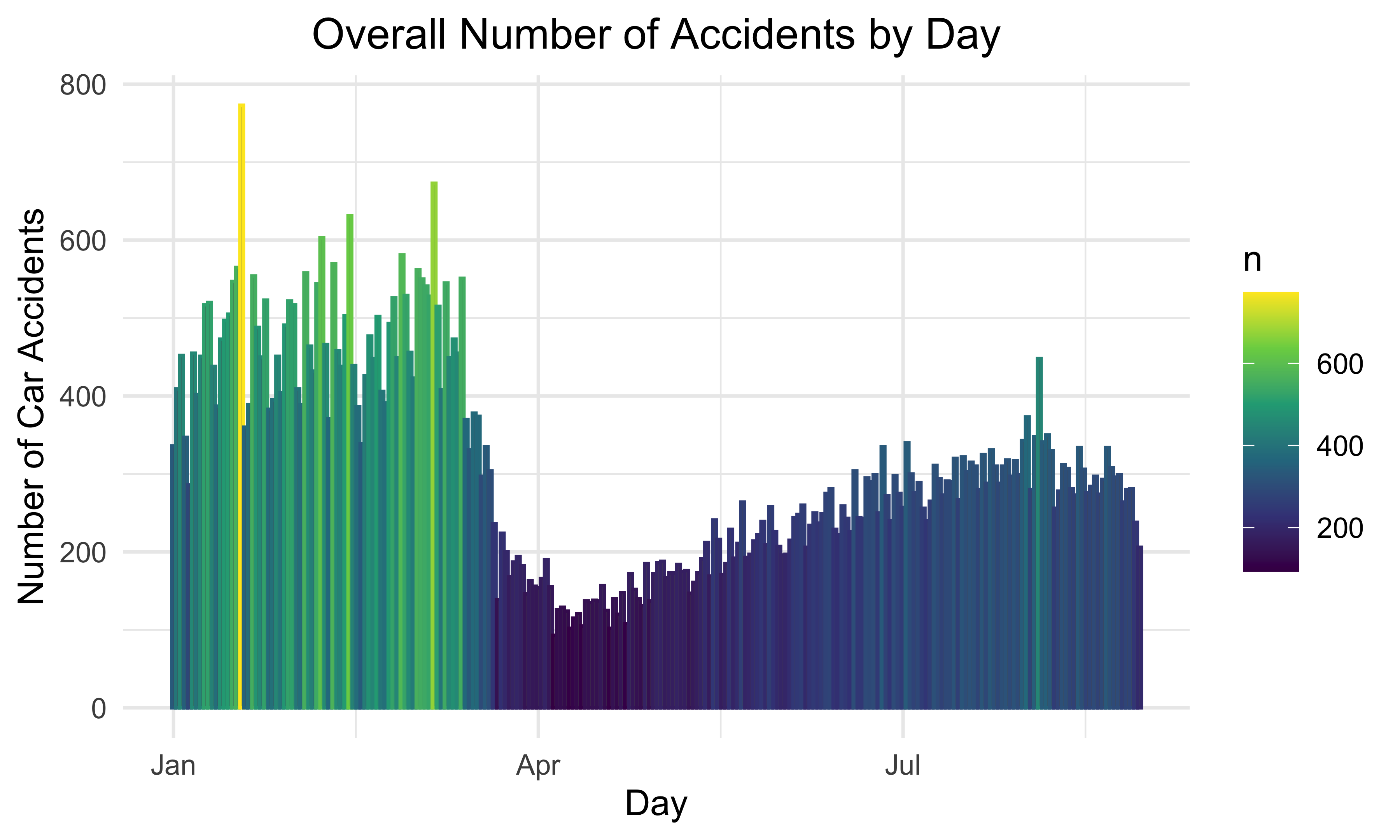
This bar plot represents the number of car accidents each day over the 8 months. Most car accidents took place from January to March. The month with the least number of car accidents is April. This graph also matches the pattern demonstrated by the previous plot.
Car Accidents over Time
In this section, we will explore the trend of car accidents over time. We will analyze the pattern of number of car accidents followed through hour, day, and month in five boroughs.
Total Accidents over Month by Borough
accidents1 %>%
  filter(!is.na(borough)) %>%
  separate(crash_date, into = c('year', 'month', 'day'), sep = "-") %>%
  mutate(
    year = as.numeric(year),
    month = as.numeric(month),
    day = as.numeric(day)
    ) %>%
  mutate(month = month.name[month],
         month = fct_relevel(month, c("January", "February", "March", "April",
                                      "May", "June", "July", "August"))) %>%
  relocate(month) %>%
  group_by(borough, month) %>%
  dplyr::summarize(n_obs = n()) %>%
  ggplot(aes(x = month, y = n_obs, group = 1, color = borough)) +
  geom_point() +
  geom_line() +
  labs(
    title = "Total Accident Numbers over Month by Borough",
    x = "Month",
    y = "Number of Accident in Each Month"
    ) +
  theme(axis.text.x = element_text(angle = 60, hjust = 1, size = 5) ) +
  facet_wrap(~ borough, nrow = 1)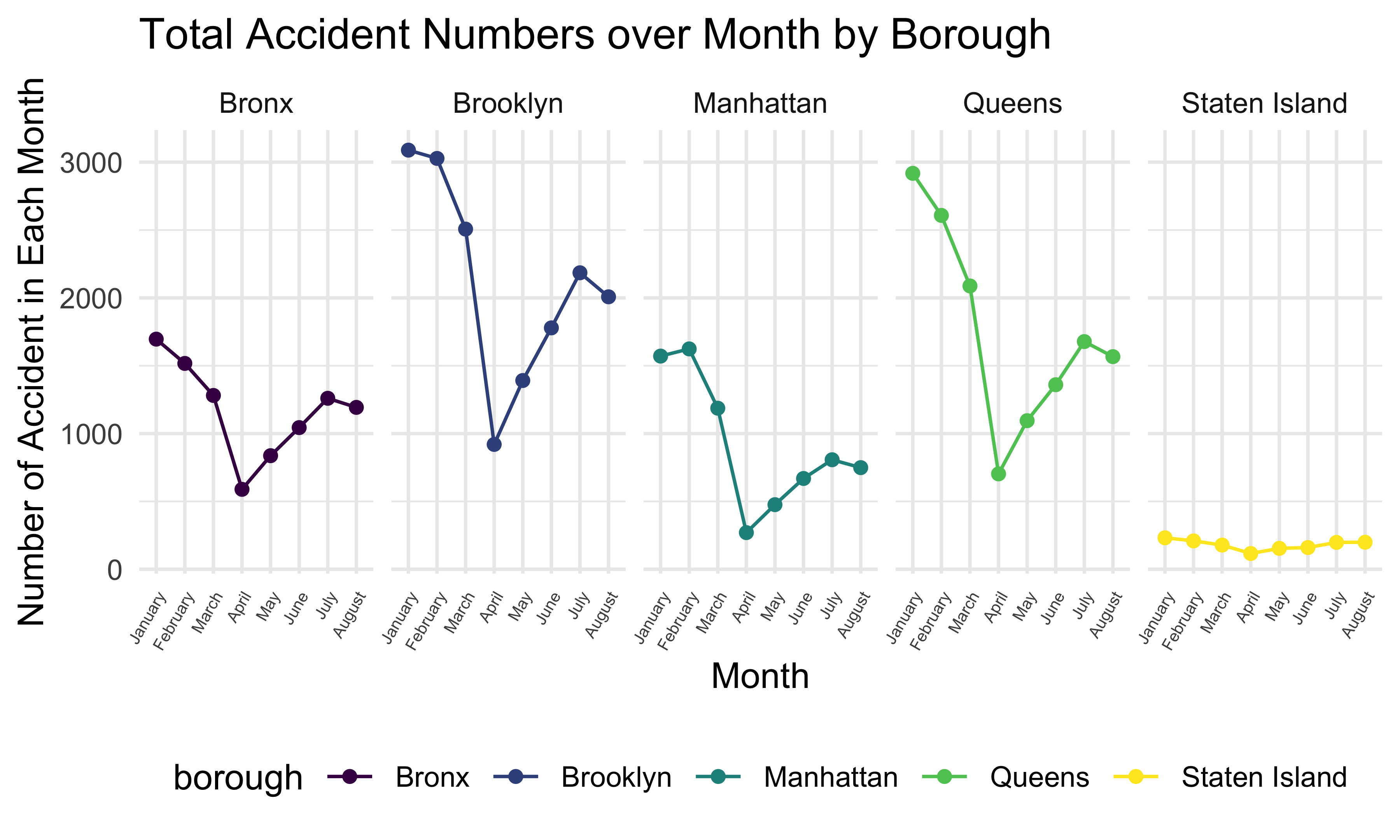
This graph shows the total number of accidents in 5 boroughs from January to August in 2020. We can see that in January, February, and March, the accident numbers in these boroughs are much higher than in other months, and the accident numbers in April are the lowest for 5 boroughs. Also, Brooklyn has the largest accident number and Staten Island has the smallest accident number among all boroughs in every month in New York.
Total Accidents over Weekday
accidents1 %>%
  filter(!is.na(borough)) %>%
  mutate(crash_date = as.Date(crash_date),
         weekday = weekdays(crash_date)) %>%
  mutate(weekday = as.factor(weekday),
         weekday = fct_relevel(weekday, "Monday", "Tuesday", "Wednesday", "Thursday",
                               "Friday", "Saturday", "Sunday")) %>%
  relocate(weekday) %>%
  group_by(borough, weekday) %>%
  dplyr::summarize(n_obs = n()) %>%
  ggplot(aes(x = weekday, y = n_obs, group = 1, color = borough)) +
  geom_point() +
  geom_line() +
  theme(axis.text.x = element_text(angle = 60, hjust = 1) ) +
  facet_wrap(~ borough, nrow = 1) +
  labs(
    title = "Total Accident Number over Weekday by Borough",
    x = "Weekday",
    y = "Number of Accident",
    color = "Borough"
    )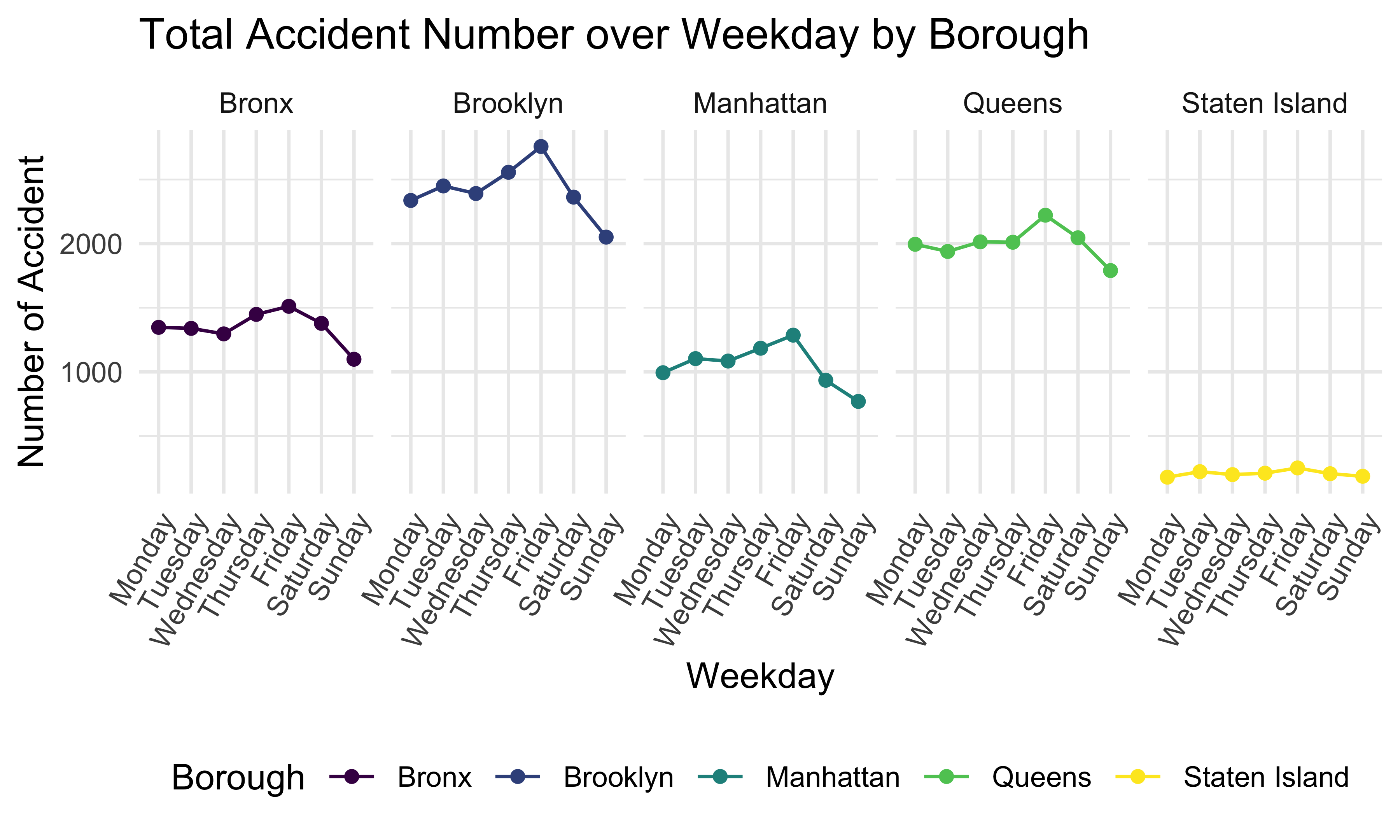
Next, this plot shows the total accident number over weekday by borough. We can tell that 5 boroughs have a similar trend, and the accident number is the highest on Friday and lowest on Sunday. Brooklyn has the highest daily accident number and Staten Island has the lowest in 5 boroughs.
Total Accidents over Hour
accidents1 %>%
  filter(!is.na(borough)) %>%
  separate(crash_time, into = c('hour', 'minute', 'second'), sep = ":") %>%
  mutate(hour = as.numeric(hour)) %>%
  group_by(borough, hour) %>%
  dplyr::summarize(n_obs = n()) %>%
  ggplot(aes(x = hour, y = n_obs, color = borough)) +
  geom_point() +
  geom_line() +
  labs(
    title = "Total Number of Accident During 24 Hours of a Day by Borough",
    x = "Hour",
    y = "Number of Accident"
    ) +
  facet_wrap(~ borough, nrow = 2)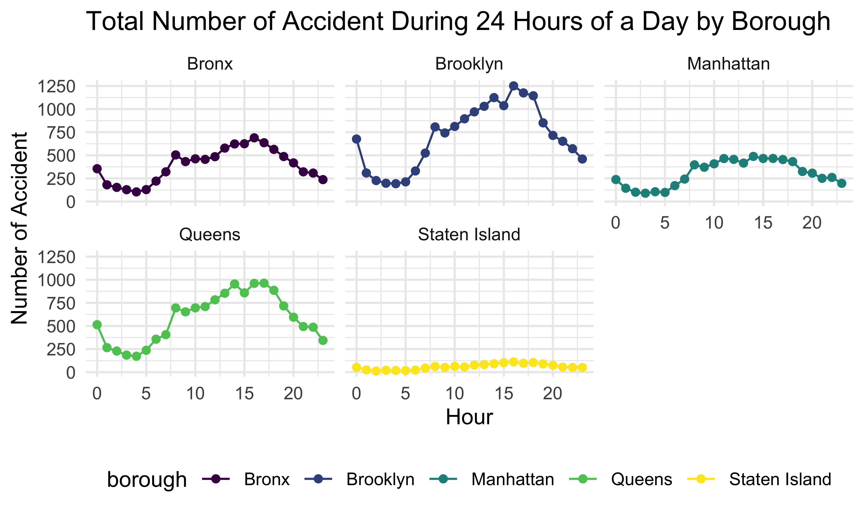
This plot shows the total accident number during 24 hours of a day by borough. We can see that 5 boroughs have a similar daily trend. The number of accidents is relatively low from 12:00 am to 6:00 am, then increases and keeps high from 8:00 am to 5:00 pm, and drops until 12:00 am.
Total Accidents in Different Part of a Day
accidents1 %>%
  group_by(hour, weekday) %>%
  count(hour) %>%
  mutate(weekday = as.factor(weekday),
         weekday = fct_relevel(weekday, "Monday", "Tuesday", "Wednesday", "Thursday", "Friday", "Saturday", "Sunday" ),
         hour = as.numeric(hour)) %>%
  ggplot(aes(x = hour, y = n, group = 1, color = hour)) +
  geom_point() +
  theme(axis.text.x = element_text(hjust = 1),
        legend.position = "none",
        plot.title = element_text(hjust = 0.5)) +
  labs(
    title = "Number of Accidents in Different Parts of Day by Weekday",
    x = "Hour",
    y = "Number of Accidents") +
  scale_x_continuous(limits = c(0, 23)) +
facet_wrap(~ weekday, nrow = 2) 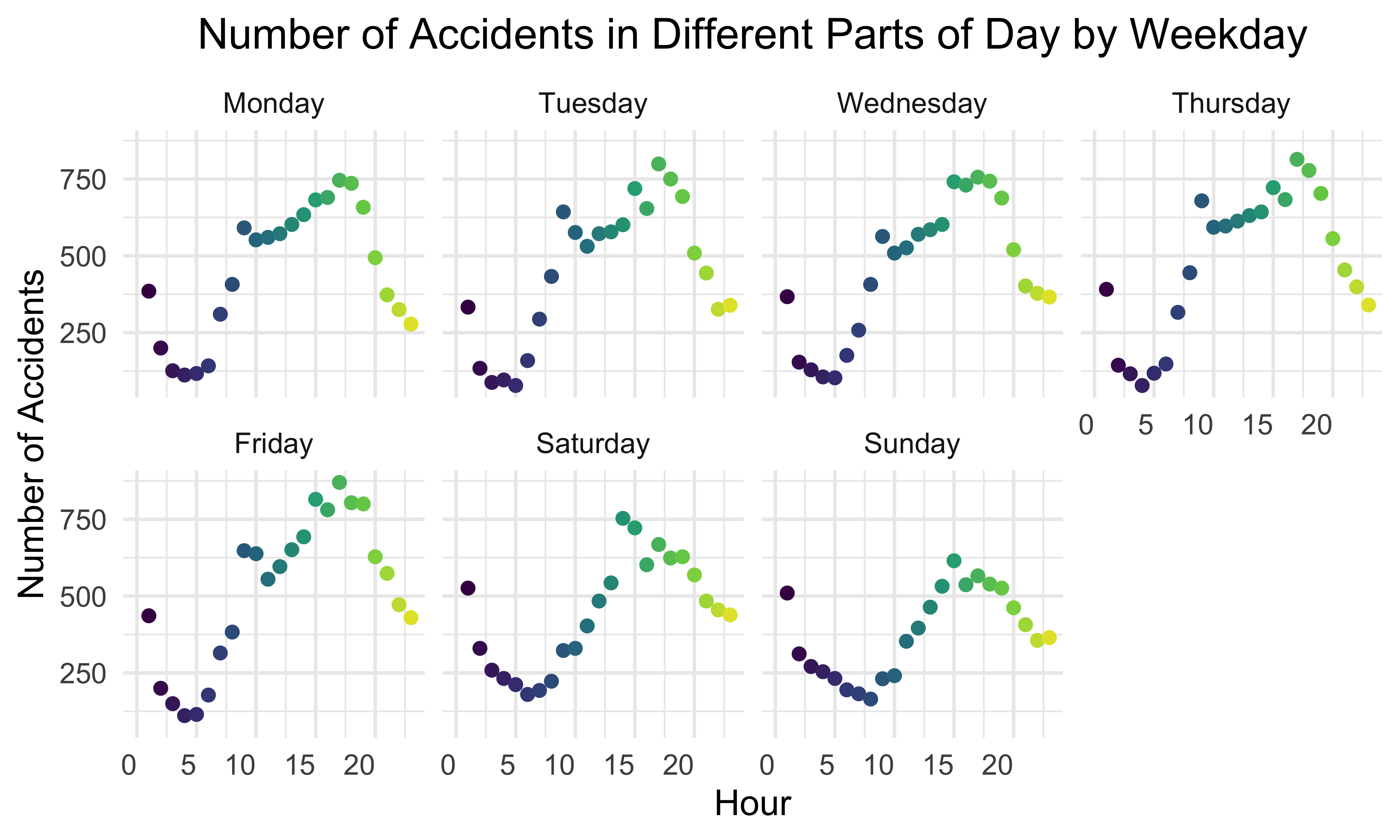
By stratifying the number of car accidents by weekdays and hours, we found out the number of car accidents tends to increase and then decrease during the day. The number of accidents reached the peak from 1:00 pm to 7:00 pm. During the week, the number of accidents is higher on weekdays than on weekends, and the maximum number of accidents is higher on weekdays. The reason for this phenomenon might be that people are more likely to be involved in accidents on weekdays between 1:00 pm and 7:00 pm, when they are commuting in rush hours. On weekends, people will spend more time at home, so the number of car accidents is relatively lower.
Car Accidents by Car Type
Then, we want to know how types of cars are associated with the number of accidents. A bar plot of the number of accidents by car type clearly represents the relationship.
Number of Accidents by Car Type
car_type_df = accidents1 %>%
  group_by(vehicle_type_code_1) %>%
  dplyr::summarize(obs = n()) %>%
  arrange(desc(obs))

accidents_cartype_bar =
  car_type_df %>%
  filter(obs > 100) %>%
  filter(!is.na(vehicle_type_code_1)) %>%
  filter(obs > 500) %>%
  mutate(vehicle_type = fct_reorder(vehicle_type_code_1, obs)) %>%
  ggplot(aes(x = vehicle_type, y = obs, fill = vehicle_type)) +
  geom_bar(stat = "identity") +
  theme_classic() +
  labs(title = "Number of Accidents by Car Type",
       y = "Number of Accidents",
       x = "Car Type") +
  geom_text(size = 3, aes(label = obs), position = position_dodge(width=0.9), vjust=-0.25) +
  ylim(0, 45000)

accidents_cartype_bar + theme(axis.text.x=element_blank(), axis.ticks.x=element_blank())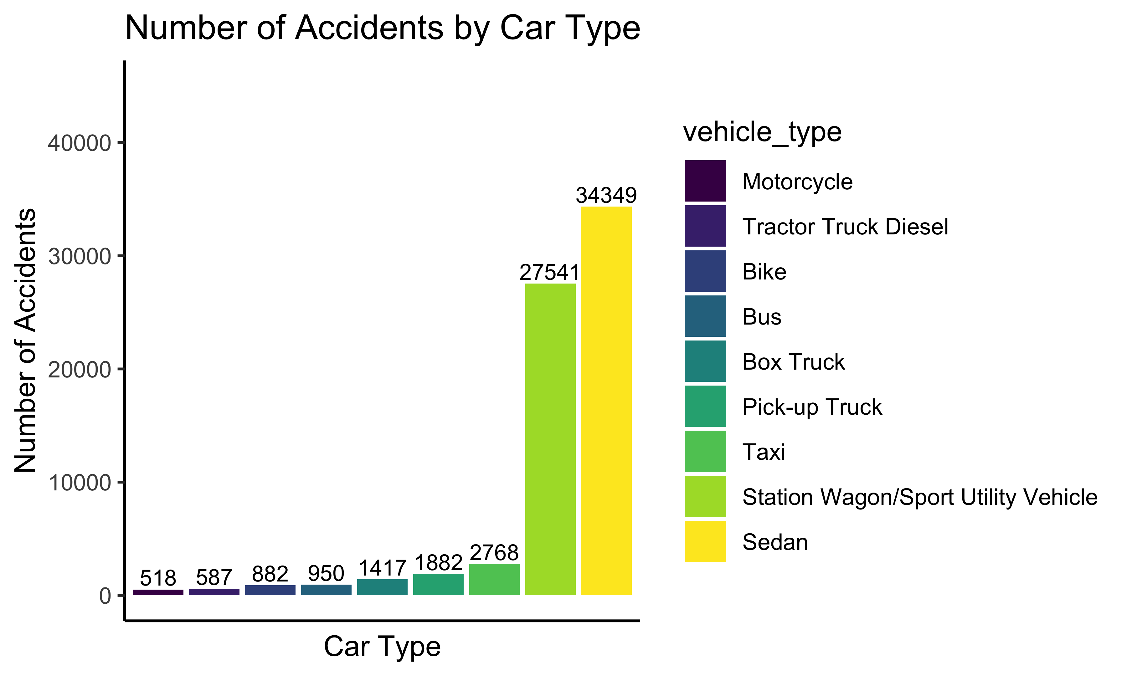
The plot shows the frequency (>500) of accidents by car type. There are mainly two types of cars with much higher frequencies than other types: sedan and station wagon/sport utility vehicle. The frequencies of these two types in 2020 are more than 25000. Other common types are taxi, pick-up truck, and box truck. The frequencies of these three types are more than 1000. Other types are bus, bike, tractor truck diesel, and motorcycles also have a frequency higher than 500.
Weather and Accidents
We also want to investigate how weather conditions make impacts on car accidents. Weather conditions and wind speed will be used to examine the relationship between weather and accidents’ severity.
Number of Accidents in Different Weather Condition
accident_weather_table = accidents2 %>%
  group_by(weather_condition) %>%
  dplyr::summarize(obs = n()) %>%
  arrange(desc(obs))

accident_weather_bar = accident_weather_table %>%
  drop_na() %>%
  filter(obs > 10) %>%
  mutate(weather_condition = fct_reorder(weather_condition, obs)) %>%
  ggplot(aes(x = weather_condition, y = obs, fill = weather_condition)) +
  geom_bar(stat = "identity") +
  theme_classic() +
  labs(title = "Number of Accidents by Weather Condition",
       y = "Number of Accidents",
       x = "Weather Condition")

accident_weather_bar + theme(axis.text.x = element_text(angle = 90, vjust = 0.5, hjust=1))
The plot shows the frequency of accidents by weather. The most common weather condition of accidents is fair, which may deviate from common sense. There are two possible reasons. The first one is that there are many more days of fair than other weather in 2020 in New York. Therefore, it is reasonable that the frequency in fair weather is higher. The other reason is that during fair weather, people tend to behave with less caution. Thus the probability of accidents increases. This question is worth further research, which has been listed in our group’s further research plan. Other common types of weather are cloudy, mostly cloudy, light rain, partly cloudy, rain, and fog.
Total Accidents by Wind Speed
accidents_windspeed = accidents2 %>%
  ggplot(aes(x = wind_speed_mph, y = ..density..)) +
  geom_histogram(color = "darkblue", fill = "lightblue") +
  labs(
    title = "Number of Accidents by Wind Speed",
       x = "Wind Speed(mph)"
  ) +
  geom_density()
accidents_windspeed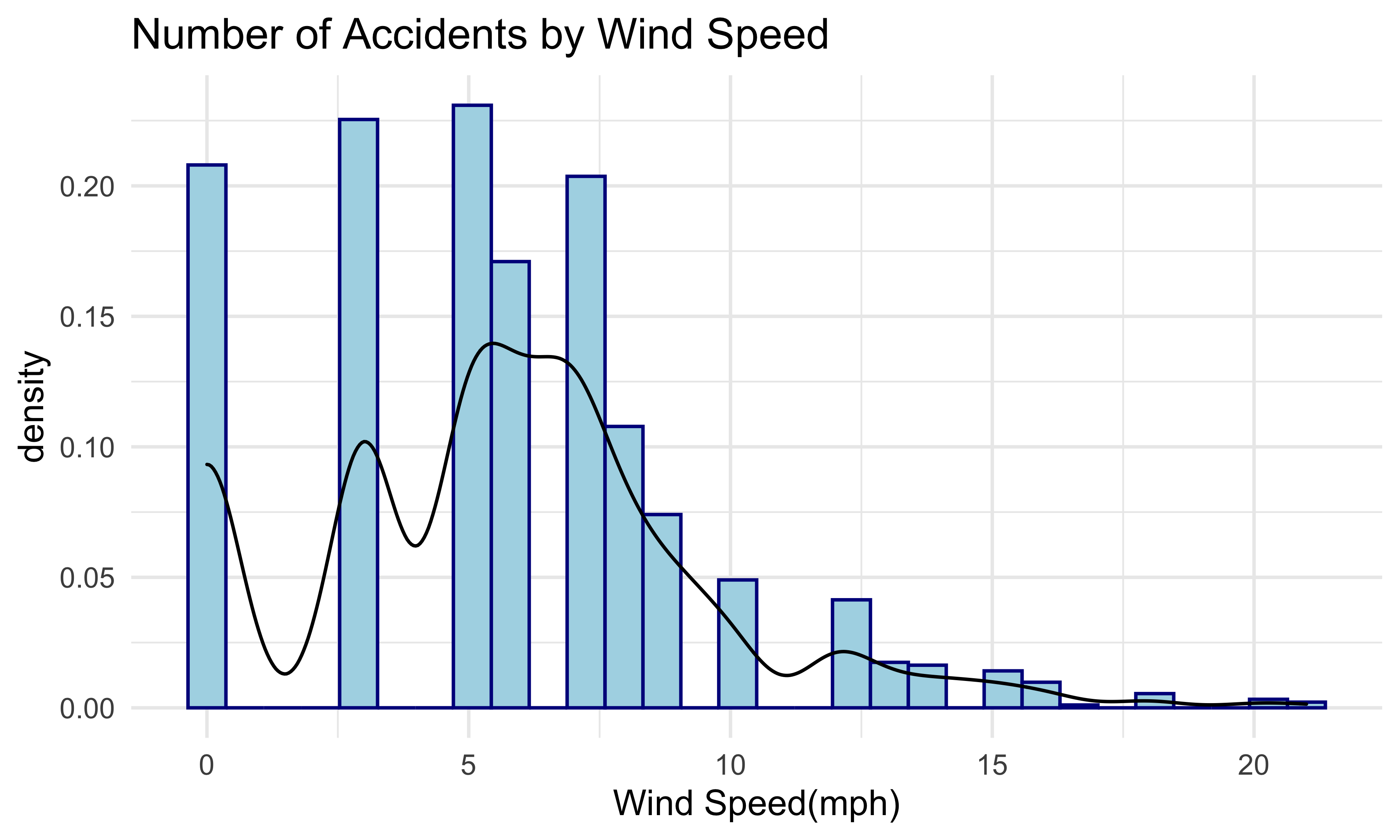
Next, this plot shows the frequency of accidents by wind speed. As shown in the plot, the distribution of frequency is right-skewed. The most common wind speed is from 0 to 7.5 miles per hour. The frequency of this interval is higher than 150. From 7.5 to 12.5 miles per hour, the frequency is moderate. The frequency of car accidents with wind speed larger than 12.5 miles per hour is less than 25.
Severity and Wind Speed
ggplot(accidents2, aes(x = wind_speed_mph, y = severity)) +
  geom_violin(trim = FALSE, fill = "light blue") +
  theme_bw() +
  coord_flip() +
  labs(
    title = "Distribution of Severity vs Wind Speed",
       y = "Wind Speed(mph)",
       x = "Severity Level"
  )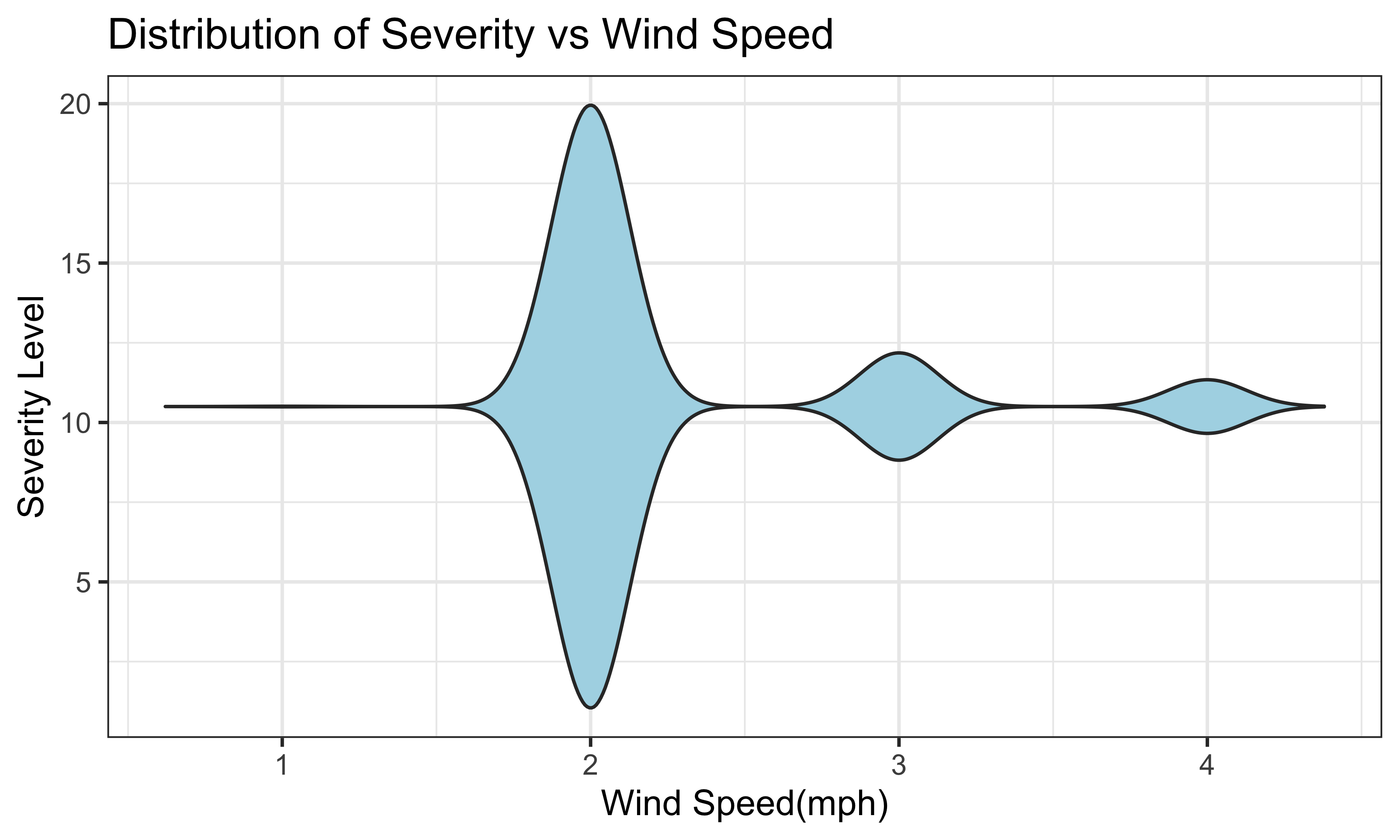
This violin plot shows the range of wind speed in each severity level. The most common severity is severity 2. For severity 2, the range of wind speed is from 0 to 20 miles per hour. For severity 3, the range is from 8 to 12.5 miles per hour. The range of wind speed of severity 4 is from 9 to 11.25 miles per hour. For severity 1, there are only 4 observations, so there is only a line for severity 1.
Accident Casualty
In this section, we will focus on the casualty of car accidents. More specifically, we will visualize the distribution of killed or injured people among different boroughs.
People Injured by Borough
injured_borough_box =
  accidents1 %>%
  filter(!is.na(borough)) %>%
  plot_ly(x = ~number_of_persons_injured, color = ~borough, type = "box", colors = "viridis") %>%
  layout(title = "<b>Number of Injuries by Borough</b>",
         xaxis = list(title = "Number of People Injured"))
injured_borough_box
People Killed by Borough
killed_borough_box =
  accidents1 %>%
  filter(!is.na(borough)) %>%
  plot_ly(x = ~number_of_persons_killed, color = ~borough, type = "box", colors = "viridis") %>%
  layout(title = "<b>Number of People Killed by Borough</b>",
         xaxis = list(title = "Number of People Killed"))
killed_borough_box
In each crash accident, Manhattan has the least serious injuries, and the other boroughs have similar injury amounts. However, Brooklyn has the largest number of injuries which is 15. The number of deaths in 5 boroughs are similar and not large. The median number of fatalities per crash is 0. However, Brooklyn also has the largest number of fatalities which is 3. Based on the information above, it can be concluded that Brooklyn has the most serious car accident fatality.
People Injured and Killed by Borough
injured_killed_bar =
accidents1 %>%
  dplyr::select(borough, number_of_persons_injured, number_of_persons_killed) %>%
  group_by(borough) %>%
  mutate(injuries_total = sum(number_of_persons_injured),
            killed_total = sum(number_of_persons_killed)) %>%
  dplyr::select(borough, injuries_total, killed_total) %>%
  unique() %>%
  filter(!is.na(borough)) %>%
  pivot_longer(
    injuries_total:killed_total,
    names_to = "types_of_casualties",
    values_to = "number_of_casualties")

injured_killed_bar_plot =
  injured_killed_bar %>%
  mutate(borough = as.factor(borough),
         borough = fct_relevel(borough, "NA", "Brooklyn", "Queens", "Bronx", "Manhattan", "Staten island")) %>%
ggplot(aes(x = borough, y = number_of_casualties, fill = types_of_casualties)) +
  geom_bar(stat = "identity",
           position = "dodge",
           width = 0.8) +
  geom_text(aes(label = number_of_casualties),
            size = 4,
            position = position_dodge(width = 0.8),
            vjust = -0.3) +
  labs(
    title = "Frequency of Casualties in Boroughs",
    x = "Borough",
    y = "Number of Casualties in Each Borough",
    fill = "Types") +
  theme_bw(base_size = 12) +
  theme(axis.text = element_text(colour = 'black'),
        plot.title = element_text(hjust = 0.5)) +
   ylim(0, 6500)
injured_killed_bar_plot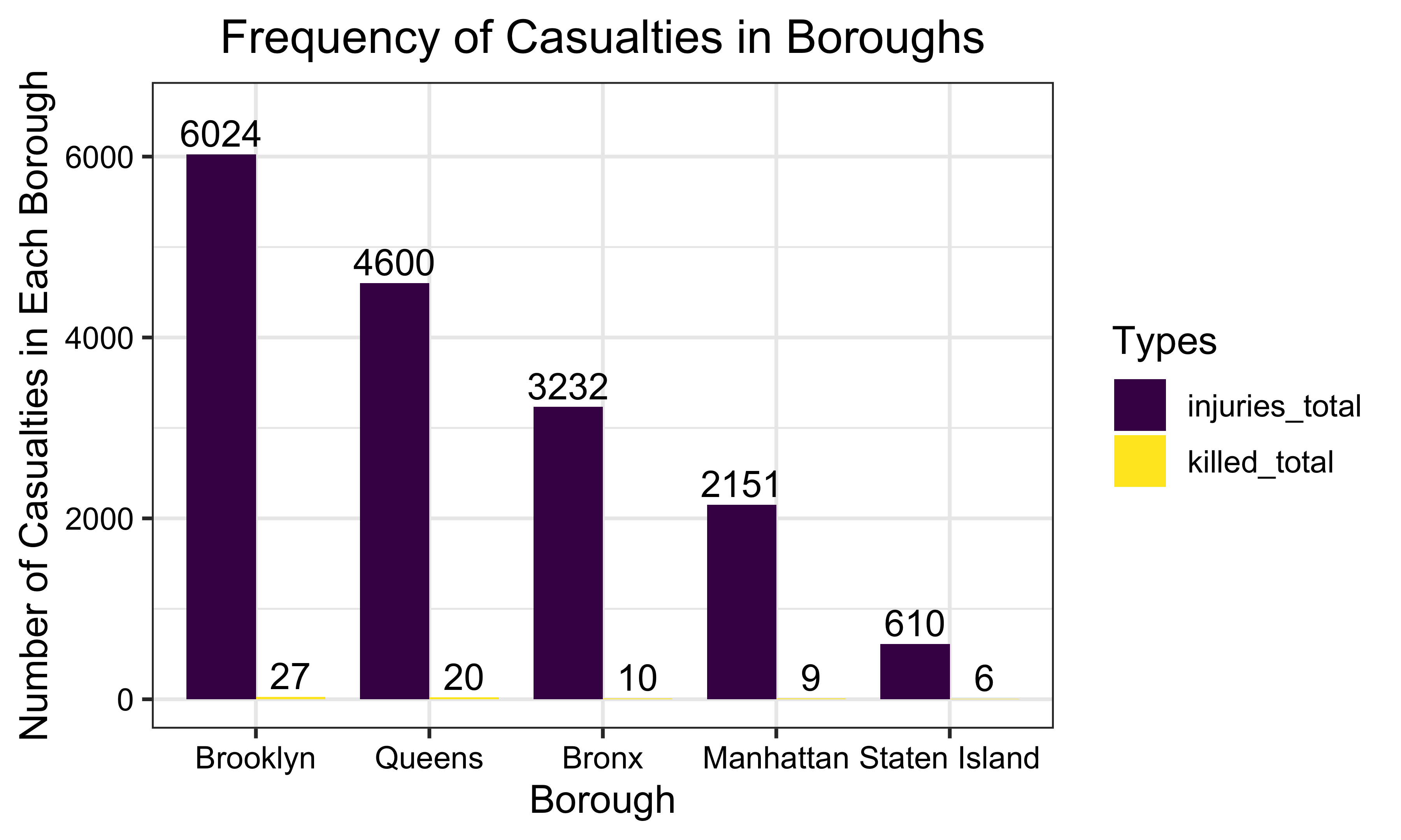
From January 2020 to August 2020, Brooklyn had the largest total number of injuries and fatalities. Conversely, Staten Island had the lowest total number of injuries and fatalities in car accidents.
The following two plots show the number of injured and killed people separately.
Total Number of People Injured by Borough
casualties_table =
accidents1 %>%
  group_by(borough) %>%
  dplyr::summarize(injuries_total = sum(number_of_persons_injured),
  killed_total = sum(number_of_persons_killed)) %>%
  filter(!is.na(borough))

injuries_borough_plot =
casualties_table %>%
  mutate(borough = forcats::fct_reorder(borough, injuries_total, .desc = TRUE)) %>%
  ggplot(aes(x = borough, y = injuries_total, fill = borough)) +
  geom_bar(stat = "identity",
           width = 0.8) +
  geom_text(aes(label = injuries_total),
            size = 4,
            position = position_dodge(width = 0.8),
            vjust = -0.3) +
  labs(
    title = "Frequency of People Injured in Boroughs",
    x = "Borough",
    y = "Number of People Injured in Each Borough") +
  theme_bw(base_size = 12) +
  theme(axis.text = element_text(colour = 'black'),
        plot.title = element_text(hjust = 0.5)) +
  ylim(0, 6500)
injuries_borough_plot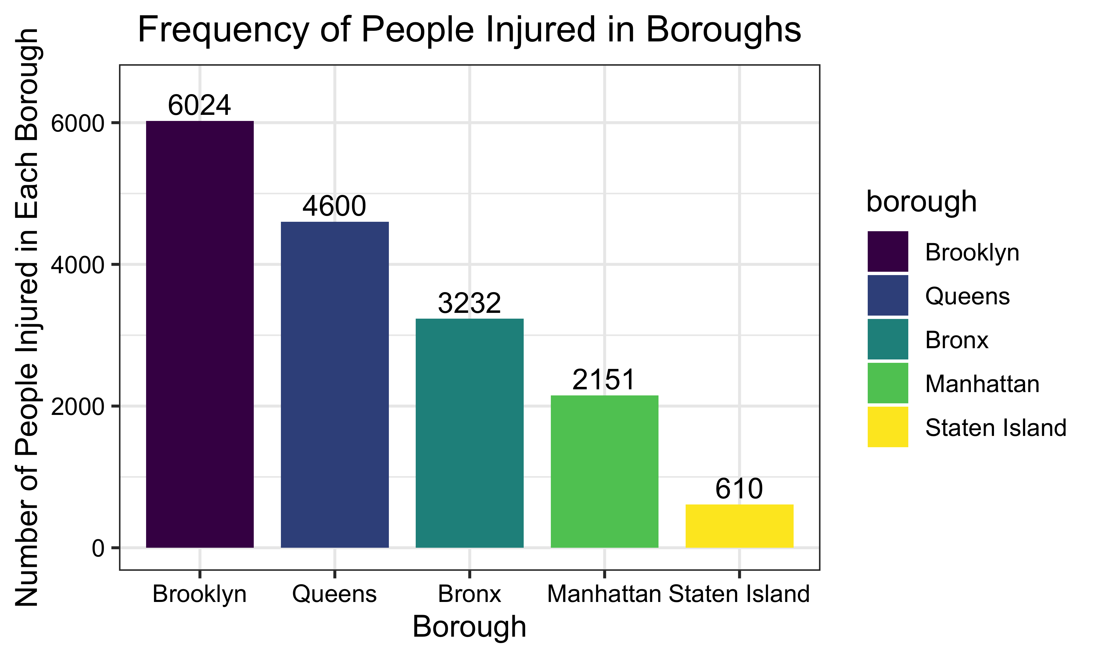
Total Number of People Killed by Borough
killed_borough_plot =
casualties_table %>%
  mutate(borough = forcats::fct_reorder(borough, killed_total, .desc = TRUE)) %>%
  ggplot(aes(x = borough, y = killed_total, fill = borough)) +
  geom_bar(stat = "identity",
           width = 0.8) +
  geom_text(aes(label = killed_total),
            size = 4,
            position = position_dodge(width = 0.8),
            vjust = -0.3) +
  labs(
    title = "Frequency of People Killed in Boroughs",
    x = "Borough",
    y = "Number of People Killed in Each Borough") +
  theme_bw(base_size = 12) +
  theme(axis.text = element_text(colour = 'black'),
        plot.title = element_text(hjust = 0.5)) +
  ylim(0, 28)
killed_borough_plot
Statistical Analyses
Chi-Squared test - Car accidents on weekdays among boroughs
To test whether the proportions of car accidents in each weekday among boroughs are equal, we perform the Chi-Squared test.
H0: The proportions of car accidents on weekdays among boroughs are equal.
H1: Not all proportions of car accidents on weekdays among boroughs are equal.
week_accidents =
  accidents1 %>%
  dplyr::select(crash_date, borough) %>%
  mutate(weekdays = weekdays(accidents1$crash_date, abbreviate = T)) %>%
  filter(!is.na(borough)) %>%
  mutate(weekdays = as.factor(weekdays),
         weekdays = fct_relevel(weekdays, "Mon", "Tue", "Wed", "Thu", "Fri", "Sat", "Sun"))

table(week_accidents$borough, week_accidents$weekdays)
##
## Mon Tue Wed Thu Fri Sat Sun
## Bronx 1347 1339 1296 1448 1511 1378 1098
## Brooklyn 2337 2450 2391 2557 2758 2363 2051
## Manhattan 993 1103 1084 1184 1286 934 769
## Queens 1995 1939 2014 2011 2222 2046 1790
## Staten Island 178 221 198 209 250 205 185chisq.test(table(week_accidents$borough, week_accidents$weekdays))##
## Pearson's Chi-squared test
##
## data: table(week_accidents$borough, week_accidents$weekdays)
## X-squared = 73.531, df = 24, p-value = 6.303e-07x_crit = qchisq(0.95, 24)
x_crit## [1] 36.41503Interpretation: At significant level \(\alpha\) = 0.05, \(p-value\) = 6.303e-07 < 0.05, so we reject the null hypothesis and conclude that there is at least one borough’s proportion of car accidents for weekdays different from others.
Chi-square test - Car type’s proportion of accident amounts among boroughs
To test whether the proportions of car accidents in five car types among boroughs are equal, we performed the Chi-square test.
H0: Proportions of accident amounts for
five car types are equal among boroughs.
H1: Not all proportions of accident amounts
for five car types are not equal among boroughs.
five_common_cartype =
  accidents1 %>%
  dplyr::select(borough, vehicle_type_code_1) %>%
  filter(vehicle_type_code_1 %in%
           c("Sedan",
             "Station Wagon/Sport Utility Vehicle",
             "Taxi",
             "Pick-up Truck",
             "Box Truck")) %>%
  count(vehicle_type_code_1, borough) %>%
  pivot_wider(
    names_from = "vehicle_type_code_1",
    values_from = "n"
  )  %>%
  data.matrix() %>%
  subset(select = -c(borough))

rownames(five_common_cartype) <- c("Bronx", "Brooklyn", "Manhattan", "Queens", "Staten Island", "Others")

five_common_cartype %>%
knitr::kable(caption = "Table of Top Five Car Type", caption.pos = "top")| Box Truck | Pick-up Truck | Sedan | Station Wagon/Sport Utility Vehicle | Taxi | |
|---|---|---|---|---|---|
| Bronx | 158 | 187 | 4451 | 3288 | 411 |
| Brooklyn | 309 | 417 | 7865 | 6329 | 425 |
| Manhattan | 275 | 213 | 2828 | 2279 | 749 |
| Queens | 188 | 359 | 6460 | 5721 | 250 |
| Staten Island | 7 | 49 | 847 | 450 | 4 |
| Others | 480 | 657 | 11898 | 9474 | 929 |
chisq.test(five_common_cartype)##
## Pearson's Chi-squared test
##
## data: five_common_cartype
## X-squared = 1614.5, df = 20, p-value < 2.2e-16Interpretation: At significant level \(\alpha\) = 0.05, the result of chi-square shows that \(\chi^2\) > \(\chi_{crit}\), so we reject the null hypothesis and conclude that there is at least one car type’s proportion of accident amounts different from others.
Proportion test - The proportions of car accidents among boroughs
We want to see whether the car accident rates are the same among boroughs, so we conduct a proportion test. We obtained the population of each borough from the most recent census.
H0: The proportions of the car accidents are equal among boroughs.
H1: The proportions of the car accidents are not equal among boroughs.
url = "https://www.citypopulation.de/en/usa/newyorkcity/"
nyc_population_html = read_html(url)

population = nyc_population_html %>%
  html_elements(".rname .prio2") %>%
  html_text()

boro = nyc_population_html %>%
  html_elements(".rname a span") %>%
  html_text()

nyc_population = tibble(
  borough = boro,
  population = population %>% str_remove_all(",") %>% as.numeric()
)

car_accident = accidents1 %>%
  filter(!is.na(borough)) %>%
  count(borough) %>%
  mutate(borough = str_to_title(borough))

acci_popu_boro = left_join(car_accident, nyc_population)

acci_popu_boro %>%
knitr::kable(caption = "Results Table", caption.pos = "top")| borough | n | population |
|---|---|---|
| Bronx | 9417 | 1472654 |
| Brooklyn | 16907 | 2736074 |
| Manhattan | 7353 | 1694251 |
| Queens | 14017 | 2405464 |
| Staten Island | 1446 | 495747 |
prop.test(acci_popu_boro$n, acci_popu_boro$population)##
## 5-sample test for equality of proportions without continuity correction
##
## data: acci_popu_boro$n out of acci_popu_boro$population
## X-squared = 1482.5, df = 4, p-value < 2.2e-16
## alternative hypothesis: two.sided
## sample estimates:
## prop 1 prop 2 prop 3 prop 4 prop 5
## 0.006394577 0.006179292 0.004339971 0.005827150 0.002916810Interpretation: From the test result, we can see that the \(p-value\) is smaller than 0.01, so we have enough evidence to conclude that the proportions of car accidents are different across boroughs.
ANOVA Test - Month and accidents
In order to study how month is associated with the number of car accidents, we try to use an ANOVA test across months.
H0: The average numbers of accidents are equal across months.
H1: The average numbers of accidents are not equal across months.
fit_accidents =
  accidents1 %>%
  mutate(month = as.factor(month)) %>%
  group_by(month, weekday, day) %>%
  dplyr::summarize(num_accidents = n())
fit_accidents_month = lm(num_accidents ~ month, data = fit_accidents)
anova(fit_accidents_month) %>%
knitr::kable(caption = "One way anova of number of accidents and month", caption.pos = "top")| Df | Sum Sq | Mean Sq | F value | Pr(>F) | |
|---|---|---|---|---|---|
| month | 7 | 2916412 | 416630.245 | 75.89771 | 0 |
| Residuals | 234 | 1284511 | 5489.365 | NA | NA |
Interpretation: As indicated by the result of the ANOVA test, the \(p-value\) is very small. Therefore, the null hypothesis is rejected and we can conclude that the average numbers of accidents are different across months in New York City in 2020.
Regression Analyses
From previous EDA steps, we recognize that the number of car accidents is associated to many factors, such as the time in the day, borough, and workday or weekend. Also, the severity level relates to weather conditions. In this section, we will examine all these four associations.
Regression of accidents against day/night
First, we want to examine whether the time in the day when the accident happend(day/night) relates to the number of accidents.
We divide a day into two parts, day and night, to see whether there is a linear relationship between car accidents number and day or night time of a day. We set 7:00 am to 7:00 pm as day, and 7:00 pm to 7:00 am as night.
reg_day_night_data = accidents1 %>%
  mutate(hour = as.numeric(hour),
         day_night = ifelse(hour %in% c(7,8,9,10,11,12,13,14,15,16,17,18), "day", "night")) %>%
  group_by(crash_date, day_night) %>%
  dplyr::summarize(n_obs = n())
reg_day_night = lm(n_obs ~ day_night, reg_day_night_data)
summary(reg_day_night)##
## Call:
## lm(formula = n_obs ~ day_night, data = reg_day_night_data)
##
## Residuals:
## Min 1Q Median 3Q Max
## -140.93 -52.74 -9.99 30.65 377.07
##
## Coefficients:
## Estimate Std. Error t value Pr(>|t|)
## (Intercept) 194.934 4.884 39.91 <2e-16 ***
## day_nightnight -80.442 6.907 -11.65 <2e-16 ***
## ---
## Signif. codes: 0 '***' 0.001 '**' 0.01 '*' 0.05 '.' 0.1 ' ' 1
##
## Residual standard error: 75.98 on 482 degrees of freedom
## Multiple R-squared: 0.2196, Adjusted R-squared: 0.218
## F-statistic: 135.6 on 1 and 482 DF, p-value: < 2.2e-16From the regression result, we can see that the \(p-value\) is less than 0.01, so we have
enough evidence to say that there is a linear association between the
number of accidents and the variable day_night. The
regression line is:
\[E(accidents) = 137.669 - 72.281I(day\_night
= night)\] Therefore, there are 72 more accidents expected at
night than in the daytime. More cars on streets in the daytime may
contribute to this result, as car accidents are more likely to happen in
heavy traffic.
Regression of accidents against borough
Second, we will figure out whether there is a linear relationship between borough and the number of accidents.
reg_borough_data = accidents1 %>%
  filter(borough %in% c("Bronx", "Brooklyn", "Manhattan", "Queens", "Staten Island")) %>%
  group_by(crash_date) %>%
  count(borough)
reg_borough = lm(n ~ borough, data = reg_borough_data)
summary(reg_borough)##
## Call:
## lm(formula = n ~ borough, data = reg_borough_data)
##
## Residuals:
## Min 1Q Median 3Q Max
## -52.864 -12.913 -1.384 8.124 124.079
##
## Coefficients:
## Estimate Std. Error t value Pr(>|t|)
## (Intercept) 38.913 1.352 28.791 < 2e-16 ***
## boroughBrooklyn 30.950 1.911 16.192 < 2e-16 ***
## boroughManhattan -8.529 1.911 -4.462 8.87e-06 ***
## boroughQueens 19.008 1.911 9.945 < 2e-16 ***
## boroughStaten Island -32.938 1.911 -17.232 < 2e-16 ***
## ---
## Signif. codes: 0 '***' 0.001 '**' 0.01 '*' 0.05 '.' 0.1 ' ' 1
##
## Residual standard error: 21.03 on 1205 degrees of freedom
## Multiple R-squared: 0.528, Adjusted R-squared: 0.5264
## F-statistic: 337 on 4 and 1205 DF, p-value: < 2.2e-16As the \(p-value\) of coefficients
is less than the predetermined significance level of 0.05, we have
evidence to reject the null hypothesis that the number of accidents are
the same in different boroughs. The regression model is: \[E(accidents) = 38.913 + 30.950I(borough =
Brooklyn) - 8.529I(borough = Manhattan) + 19.008I(borough = Queens) -
32.938I(borough = Staten Island)\]
From the summary of the regression result, the reference borough is
Bronx. The average number of accidents in Bronx is 38.91. In Brooklyn,
the average number of accidents is 30.95 higher than Bronx. The average
number of accidents in Manhattan is 8.53 lower than Bronx. For Queens,
the average number of accidents is 19 less than Bronx. The average
number of accidents in Staten Island is 32.94 lower than Bronx. Brooklyn
has the highest average number of accidents and Staten Island has the
least average number of accidents.
Regression of accidents against workday/weekend
Next, we want to examine whether workdays/weekends relates to the number of accidents.
As weekdays is a categorical variable so we take
workdays as the reference category. To test whether there is a linear
association between the number of car accidents and workdays, we conduct
the hypothesis test and set \(\alpha\)
= 0.1.
reg_workdays_weekends_data =
  accidents1 %>%
  filter(!is.na(borough)) %>%
  mutate(weekdays_type = if_else(weekday %in% c("Saturday", "Sunday"), "Weekends", "Workdays")) %>%
  dplyr::select(-borough) %>%
  group_by(crash_date, weekdays_type) %>%
  count(crash_date, weekdays_type) %>%
  mutate(weekdays_type = as.factor(weekdays_type))
reg_workdays_weekends = lm(n ~ weekdays_type, data = reg_workdays_weekends_data)
summary(reg_workdays_weekends)##
## Call:
## lm(formula = n ~ weekdays_type, data = reg_workdays_weekends_data)
##
## Residuals:
## Min 1Q Median 3Q Max
## -145.95 -68.95 -11.45 69.22 327.22
##
## Coefficients:
## Estimate Std. Error t value Pr(>|t|)
## (Intercept) 209.948 6.639 31.623 <2e-16 ***
## weekdays_typeWeekends -24.165 12.433 -1.944 0.0531 .
## ---
## Signif. codes: 0 '***' 0.001 '**' 0.01 '*' 0.05 '.' 0.1 ' ' 1
##
## Residual standard error: 87.32 on 240 degrees of freedom
## Multiple R-squared: 0.0155, Adjusted R-squared: 0.01139
## F-statistic: 3.778 on 1 and 240 DF, p-value: 0.05311According to the results, \(p-value\) = 0.05311 < 0.1, so we can
reject the null and conclude that we are 90% confident that there is a
significant linear association between the number of car accidents and
weekdays. The regression line is:
\[E(accidents) = 209.948 - 24.165I(weekdays =
weekends)\] On weekends, the average number of car accidents will
decrease by approximately 24.
Regression of accidents against weather condition
Finally, we want to explore the association between the number of accidents and weather conditions: visibility, temperature, and pressure.
This is the correlation plot between the number of accidents and weather conditions.
chart.Correlation(as.matrix(accidents2[, c(2, 25:29, 31:32)]), histogram=TRUE, pch=19)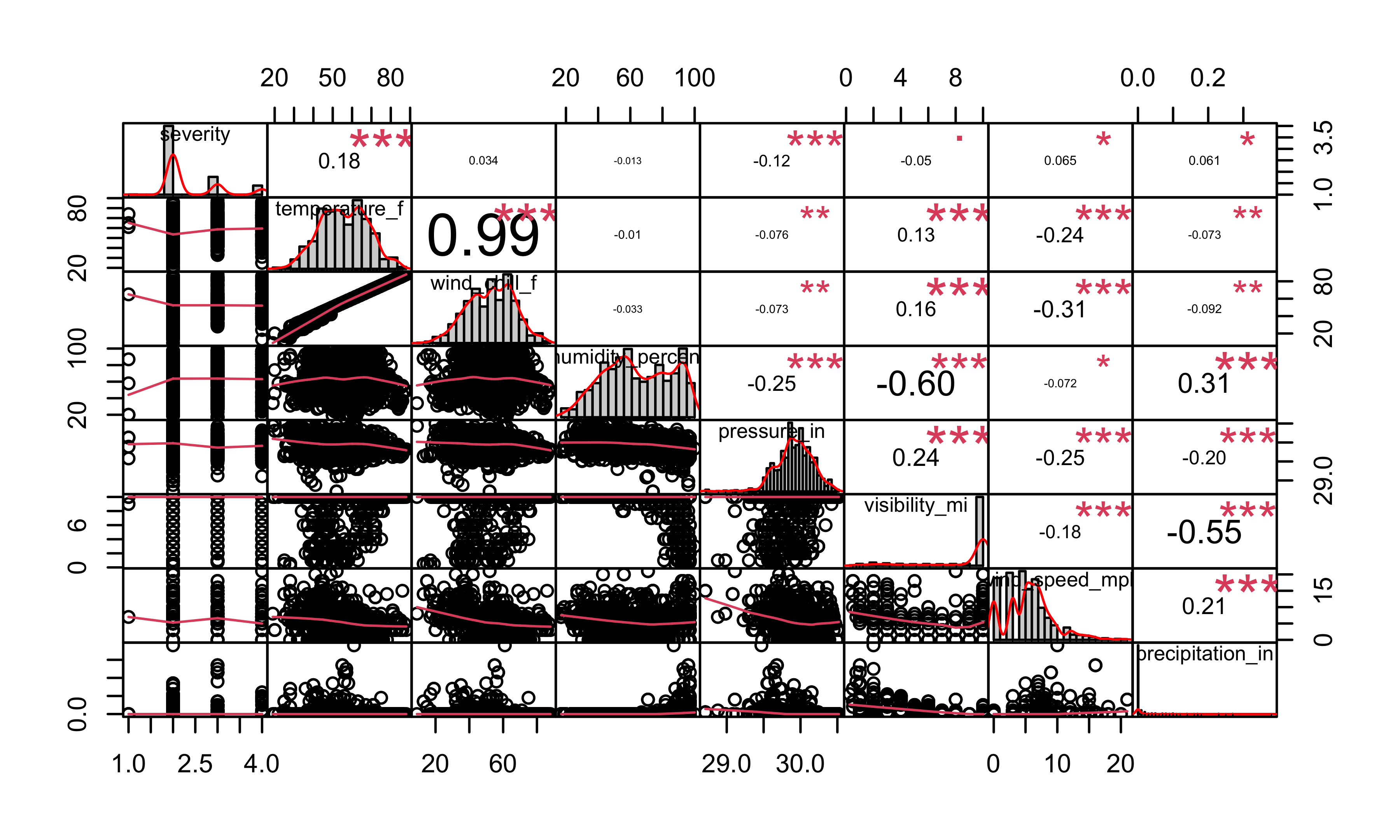
From the plot, we can see that there is a potential linear relationship between severity and weather conditions. Then, we investigate the interaction of temperature and pressure.
reg_weather = lm(severity ~ visibility_mi + temperature_f * pressure_in, data = accidents2)
summary(reg_weather)
##
## Call:
## lm(formula = severity ~ visibility_mi + temperature_f * pressure_in,
## data = accidents2)
##
## Residuals:
## Min 1Q Median 3Q Max
## -1.6245 -0.3832 -0.2667 0.3783 1.8275
##
## Coefficients:
## Estimate Std. Error t value Pr(>|t|)
## (Intercept) -18.170686 8.219341 -2.211 0.027210 *
## visibility_mi -0.015607 0.007020 -2.223 0.026363 *
## temperature_f 0.554606 0.156171 3.551 0.000396 ***
## pressure_in 0.674596 0.274756 2.455 0.014195 *
## temperature_f:pressure_in -0.018231 0.005216 -3.495 0.000488 ***
## ---
## Signif. codes: 0 '***' 0.001 '**' 0.01 '*' 0.05 '.' 0.1 ' ' 1
##
## Residual standard error: 0.6405 on 1454 degrees of freedom
## (30 observations deleted due to missingness)
## Multiple R-squared: 0.05344, Adjusted R-squared: 0.05084
## F-statistic: 20.52 on 4 and 1454 DF, p-value: < 2.2e-16Based on the summary output of the model, it is indicated that the main effect of temperature and its interaction with pressure have the most significance. The main effects of visibility and pressure are also significant with \(p-values\) less than the predetermined level of 0.05. The regression line is: \[E(severity) = -18.170 - 0.016visibility + 0.555temperature + 0.675pressure - 0.018temperature*pressure\]
Mapping
Mapping: Number of Car Accidents
In the previous statistical analysis, we conducted a proportion test to see whether the car accidents rates are the same in each borough. The results show that the proportions of car accidents are different across boroughs. Now we are still interested in the relationship between the location and the number of accidents, so we created a map to visualize to further explore this relationship.
In order to clearly see the difference in each borough, we first cleaned the data by removing rows with missing values for the borough, latitude, and longitude variables, aggregated the latitude and longitude and kept two decimal places.
map_data =
accidents1 %>%
  filter(!is.na(borough)) %>%
  filter(!is.na(latitude)) %>%
  filter(!is.na(longitude)) %>%
  mutate(
    latitude = round(latitude, digits = 2),
    longitude = round(longitude, digits = 2)) %>%
  group_by(latitude, longitude) %>%
  count(latitude, longitude, borough) %>%
  arrange(desc(n)) %>%
mutate(text_label = str_c("</b>Lat: ", latitude, "°", "</b><br>Lng: ", longitude, "°", "</b><br>Borough: ", borough, "</b><br>Number_of_accidents: ", n))

pal = colorNumeric(
  palette = "YlGnBu",
  domain = map_data$n)

map_data %>%
  leaflet()  %>%
  setView(lng = -74.00666, lat = 40.71643, zoom = 10) %>%
  addTiles() %>%
  leaflet::addLegend("bottomright",
            pal = pal,
            values = ~n,
            title = "Number of Car Accidents</br>",
            bins = 10,
            opacity = 1,
            labFormat = labelFormat(suffix = " cases")
  ) %>%
  addCircleMarkers(
    lng = ~longitude,
    lat = ~latitude,
    color = ~pal(n),
    radius = 4,
    popup = ~ text_label,
    fillOpacity = 0.8,
    stroke = FALSE,
    opacity = 1)
According to the plot, the color scale indicated the number of car accidents at each location, with warmer colors (yellow) indicating a lower number of accidents and cooler colors (blue and green) indicating a higher number of accidents. From the mapping plot, we can see that the accidents occurred more in Bronx and Manhattan from January 2020 to August 2020, followed by Brooklyn. Fewer accidents occurred in Queens and Staten Island.
All of the information can be used to identify areas of the city with higher numbers of car accidents and develop strategies for reducing the number of accidents in those areas. For example, one potential strategy might be deploying more traffic police to areas with high numbers of accidents in order to maintain traffic order and reduce congestion.
Mapping: Number of Injuries
We generated an interactive map to show the locations of car accidents in New York City in 2020 and the number of injuries resulting from each accident.
accidents_2020_map = accidents1 %>%
  filter(!is.na(borough)) %>%
  filter(!is.na(latitude)) %>%
  filter(!is.na(longitude)) %>%
  mutate(
    total_injured = number_of_persons_injured + number_of_pedestrians_injured + number_of_cyclist_injured + number_of_motorist_injured,
    textlab = paste0("Number of Injuries: ", total_injured, "\nAddress: ", on_street_name)
  )

total_injuried_map = accidents_2020_map %>%
  plot_ly(
    lat = ~latitude,
    lon = ~longitude,
    type = "scattermapbox",
    mode = "markers",
    alpha = 0.5,
    color = ~total_injured,
    text = ~textlab,
    colors = "YlOrRd")

total_injuried_map %>% layout(
    mapbox = list(
      style = 'carto-positron',
      zoom = 9,
      center = list(lon = -73.9, lat = 40.7)),
      title = "<b> Total Number of Injuries </b>",
      legend = list(title = list(text = "Borough of Accidents", size = 9),
                    orientation = "h",
                   font = list(size = 9)))
From the plot, we can tell that the maximum injury in one accident is 30 people. However, most accidents have less than 5 injuries. A few accidents have more than 5 injuries.
This information can be used to identify areas of the city with higher numbers of injuries and develop strategies for reducing the number of injuries in those areas. For example, one potential strategy might be increasing public awareness of road safety and encouraging drivers to be more careful in areas with high numbers of injuries.
Next Step and discussion
In recent years, the COVID-19 epidemic has been raging in the United States, bringing great impact to all areas of the country, and transportation is no exception. The pandemic limits people’s travel and makes the overall atmosphere of the society more chaotic where people are under greater pressure. All of the outcomes may contribute to car accidents.
At the present stage, our regression on car accidents focused on the borough, car type, time, and weather condition, and we didn’t take into account the impact of COVID-19. Therefore, we want to combine data about the pandemic such as the number of positive patients or the number of deaths to conduct our analysis to see whether there is a relationship between COVID-19 epidemic and car accidents.
The current bar chart of the number of accidents by weather condition shows the most common weather condition is fair. This finding actually is a little away from common sense. There are two possible reasons. The first one is that there are much more days of fair than other weather in 2020 in New York, so it is reasonable that the frequency in fair weather is higher. The other reason is that during fair weather, people tend to behave with less caution. Thus the probability of accidents increases. It is possible to explore this question by doing some research on weather conditions in New York in 2020.
Findings and Summary
EDA
- Besides those with no reason specified, the most common contributing factors leading to car accidents is drivers’ inattention and distraction.
- In 2020, most car accidents occurred on Belt Parkway in New York City.
- Among all boroughs in NYC, Brooklyn has the most car accidents while Staten Island has the least.
- Among all boroughs in NYC, Brooklyn has the most serious car accident injuries and fatalities, while Staten Island has the least.
- From January to August in 2020, there tends to be less car accidents in April in NYC.
- The accident number in April is the lowest and in January is the highest for each borough.
- The accident number is the largest on Friday and lowest on Sunday for each borough.
- The number of accidents is relatively low from 0:00 am to 6:00 am, then increases and keeps high from 8:00 am to 17:00 pm, and drops until 24:00 pm for 5 boroughs.
- Among all accidents, severity two is the most common severity level.
- The wind speed has a largest range in severity, which are between 0 and 20 miles per hour.
Statistical Findings
- ANOVA test: The number of car accidents is associated with month and weekday.
- Proportion test: The proportions of car accidents are different across boroughs.
- Chi-Square test: At least one car type’s proportion of accident amounts is different than others.
- Chi-Squared test: At least one borough has a different proportion of crashes for weekdays.
Regression
- The association between the number of car accidents and weekdays(weekends = 1, workdays = 0): we are 90% confident that there is a significant linear association between the number of car accidents and weekdays.
- The association of brough and number of accidents is significant. Brooklyn has the highest average number of accidents and State Island has the least average number of accidents.
- The association between the number of accidents with day or night is significant, and there are expected 72 more accidents at night than in day time.
Mapping
- Number of car accidents: Accidents occurred more in Bronx and Manhattan, followed by Brooklyn. Fewer accidents occurred in Queens and Staten island .
- Number of injuries in each accident: Most accidents have an injury less than 10.
Limitation
Several limitations exist for our project. Our first dataset on car accidents in New York City only contained information from January to August of 2020, meaning the sample size is relatively limited and the dataset could be a little out-of-date. The study may not be representative of car accidents taken place in other time periods or locations, indicating a possibly low generalizability.
This dataset also does not contain a fair amount of continuous variables, making it hard to conduct related regression analysis. Most of our regression analysis involved using factors and categorical variables. This also leads to why we introduced our second dataset containing information of all car accidents in the United States from 2016 to 2021. This is a relatively complex dataset, which was also seen as one of our limitations for the data manipulation step. To better correspond to the first dataset, we only kept the observations in New York City in 2020 for further analysis. This may also result in another constraint, as the selected sample has a limited size.
Strategies for reducing the number of car accidents in NYC
Our project aims to help people better understand what commonly causes car accidents by utilizing a scientific approach such that more accidents may be avoided in the future. Based on the above findings, potential strategies for reducing the number of car accidents in New York City include:
Advising drivers to be on the alert and maintain focus when on the road, such as setting cellphones to the “Do Not Disturb” mode during the drive, which could provide them with necessary time to react and ideally so as to prevent an accident from taking place.
Encouraging people to use alternative modes of transportation, such as public transit, cycling, or walking, whenever possible. This can help to reduce the number of cars on the roads and decrease the risk of accidents.
Targeting preventive efforts such as deploying more traffic police to high-risk areas such as Brooklyn to maintain traffic order and safety in areas. This can help to enforce traffic laws, monitor dangerous driving behaviors, and intervene in potential accidents to prevent them from occurring.
Implementing measures to improve visibility on the roads, such as better lighting or clearer road signs, to reduce the number of accidents during times of low visibility.
Monitoring and responding to changes in weather conditions, such as pressure and temperature, to anticipate and mitigate the potential impact on car accidents.