Frequency
First, we will focus on factors that relate to the number of accidents. We use bar charts to illustrate the number of accidents by contributing factors, street, borough and month, and day.
10 Most Common Contributing Factors
contr_factors =
  accidents1 %>%
  count(contributing_factor_vehicle_1) %>%
  mutate(
    contributing_factor_vehicle_1 = fct_reorder(contributing_factor_vehicle_1, n),
    ranking = min_rank(desc(n))
  ) %>%
  filter(ranking <= 10) %>%
  arrange(n)

contr_factors %>%
  ggplot(aes(x = contributing_factor_vehicle_1, y = n, fill = contributing_factor_vehicle_1)) +
  geom_col() +
  labs(title = "10 Most Common Contributing Factors of Car Accidents",
       x = "Contributing Factors",
       y = "Number of Car Accidents") +
  coord_flip() +
theme(legend.position = "none", plot.title = element_text(hjust = 1)) 
We first tried to figure out which factors are the leading factors of car accidents. We constructed a bar plot illustrating the top 10 most common contributing factors of car accidents. Except accidents without specified reasons, drivers’ inattention and distraction are shown to be the top common factor resulting in car accidents. Other common reasons include following the front car too closely, failure to yield right-of-way, and so forth.
Top 10 Streets of Accidents
streets =
  accidents1 %>%
  filter(on_street_name != "NA") %>%
  count(on_street_name) %>%
  mutate(
    on_street_name = fct_reorder(on_street_name, n),
    ranking = min_rank(desc(n))
  ) %>%
  filter(ranking <= 10) %>%
  arrange(n)

streets %>%
  ggplot(aes(x = on_street_name, y = n, fill = on_street_name)) +
  geom_col() +
  labs(title = "Top 10 Streets of Car Accidents",
       x = "Street Name",
       y = "Number of Car Accidents") +
  coord_flip() +
theme(legend.position = "none", plot.title = element_text(hjust = 0.5)) 
Then, we explored the streets where most car accidents have taken place. The bar graph indicates that Belt Parkway has the most car accidents. Long Island Expressway, Brooklyn Queens Expressway, and FDR Drive also have a relatively great amount of accidents.
Number of Accidents in Boroughs by Month
accidents1 %>%
  filter(borough != "NA") %>%
  group_by(borough) %>%
  count(month) %>%
  mutate(month = month.abb[month],
         month = fct_relevel(month, c("Jan", "Feb", "Mar", "Apr","May","Jun", "Jul", "Aug"))) %>%
  ggplot(aes(x = month, y = n, fill = borough)) +
  geom_bar(stat = "identity",
           position = "dodge") +
  labs(
    title = "Number of Car Accidents in Boroughs Over Month",
    x = "Month",
    y = "Number of Car Accidents",
    fill = "Borough") +
theme(plot.title = element_text(hjust = 0.5)) 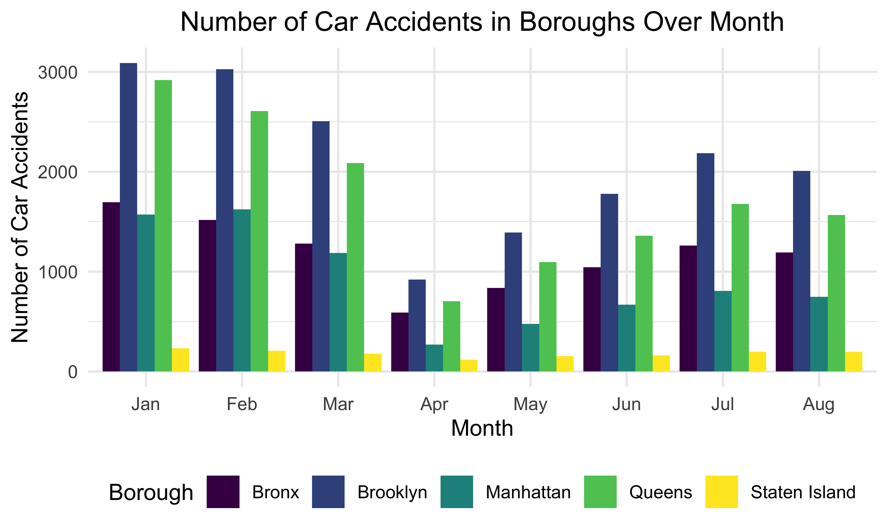
We also investigated the overall pattern of car accidents in different boroughs over months. There tend to be most car accidents in January and February while least car accidents took place in April. Overall, the number of car accidents decreases from January to April and increases from April to July. Brooklyn seems to have the most car accidents while least car accidents occurred in Staten Island over the 8 months in New York City.
Overall Number of Accidents by Day
accidents1 %>%
  group_by(crash_date) %>%
  count(crash_date) %>%
  ggplot(aes(x = crash_date, y = n, color = n)) +
  geom_col() +
  labs(title = "Overall Number of Accidents by Day",
       x = "Day",
       y = "Number of Car Accidents") +
theme(legend.position = "right", plot.title = element_text(hjust = 0.5)) 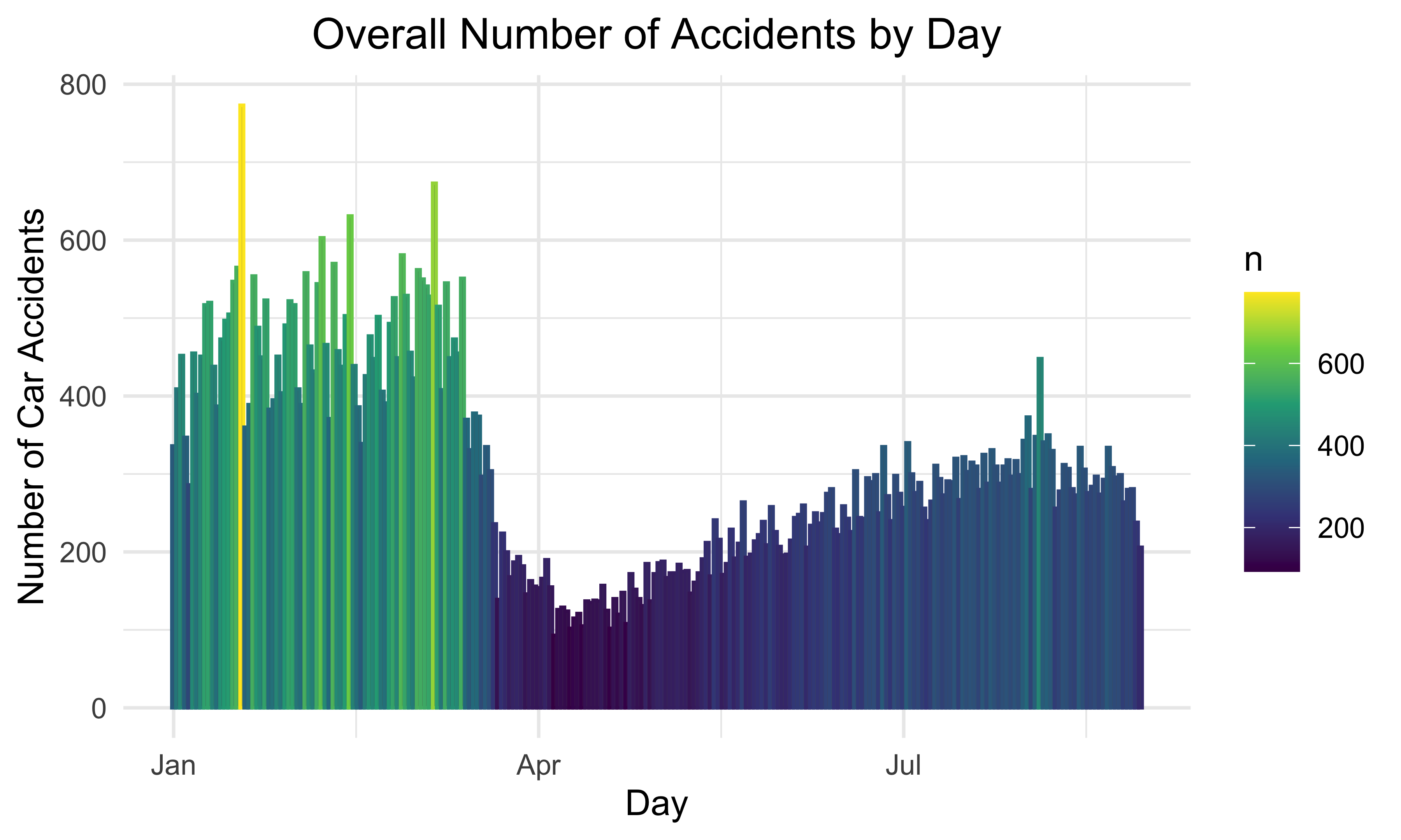
This bar plot represents the number of car accidents each day over the 8 months. Most car accidents took place from January to March. The month with the least number of car accidents is April. This graph also matches the pattern demonstrated by the previous plot.